各类常用网页布局方式:静态、自适应、流式、弹性、网格布局。
网页布局
静态布局
意思就是只是针对某个屏幕下设计的网页,当屏幕大小改变时,页面布局不会发生变化,就像经常所看到的滚动条。
自适应布局
特点是分别为不同的屏幕设置布局格式,当屏幕大小改变时,会出现不同的布局,意思就是在这个屏幕下这个元素块在这个地方,但是在那个屏幕下,这个元素块又会出现在那个地方。只是布局改变,元素不变。可以看成是不同屏幕下由多个静态布局组成的。
使用了媒体查询1
<meta name="viewport" content="width=device-width, initial-scale=1.0">
流式布局
特点是随着屏幕的改变,页面的布局没有发生大的变化,可以进行适配调整,这个正好与自适应布局相补。
PC端常见布局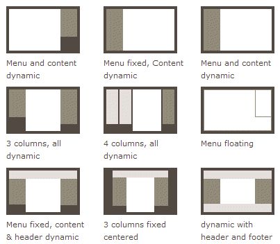
浮动布局float
BFC 即 Block Formatting Contexts (块级格式化上下文)
Formatting context(格式化上下文) 是 W3C CSS2.1 规范中的一个概念。它是页面中的一块渲染区域,并且有一套渲染规则,它决定了其子元素将如何定位,以及和其他元素的关系和相互作用。
具有 BFC 特性的元素可以看作是隔离了的独立容器,容器里面的元素不会在布局上影响到外面的元素,并且 BFC 具有普通容器所没有的一些特性。
只要元素满足下面任一条件即可触发 BFC 特性:
- body 根元素
- 浮动元素:float 除 none 以外的值
- 绝对定位元素:position (absolute、fixed)
- display 为 inline-block、table-cells、flex
- overflow 除了 visible 以外的值 (hidden、auto、scroll)
特性
- 同一个 BFC 下外边距会发生折叠
- BFC 可以包含浮动的元素(清除浮动,使浮动在BFC盒子内)
- BFC 可以阻止元素被浮动元素覆盖(清除浮动,BFC盒子内不受外部浮动影响)
1 | <!DOCTYPE html> |
定位布局position
1 | <!DOCTYPE html> |
表格布局table
缺点:
- table比其它html标记占更多的字节。(造成下载时间延迟,占用服务器更多流量资源)
- table会阻挡浏览器渲染引擎的渲染顺序。(会延迟页面的生成速度,让用户等待更久的时间)
- table里显示图片时需要你把单个、有逻辑性的的图片切成多个图。(增加设计的复杂度,增加页面加载时间,增加http会话数)
- 在某些浏览器中,table里的文字的拷贝会出现问题。(会让用户不悦)
- table会影响其内部的某些布局属性的生效(比如
里的元素的height:100%) (限制页面设计的自由性) - 一旦学了CSS的知识,你会发现使用table做页面布局会变得更麻烦。(先花时间学一些CSS知识,会省去你以后大量的时间)
- ‘table对’对于页面布局来说,从语义上看是不正确的。(它描述的是表现,而不是内容)
- table代码会让阅读者抓狂。(不但无法利用CSS,而且会不知所云,尤其在进行页面改版或内容抽取的时候)
- table一旦设计完成就变成死的,很难通过CSS让它展现新的面貌。
1 | <!DOCTYPE html> |
弹性布局flex
弹性布局重点在单一横排和单一竖排的样式应用
1 | <!DOCTYPE html> |
网格布局grid
grid-area是应用的重点
1 | <!DOCTYPE html> |
响应式布局
就是分别为不同的屏幕设计的布局方式,可以理解成自适应布局和流程布局的结合。
媒体查询+各类流式布局
1 | @media (max-width: 1200px) { |
在响应式编程中,比较难处理的就是图片。需要针对不同设备的分辨率进行适配,同时要保持较好的兼容性。在处理图片时,有以下的小技巧:
- 为图像使用相对尺寸,防止它们意外溢出容器。
- 如果您要根据设备特性(亦称艺术指导)指定不同图像,则使用 picture 元素。
- 在 img 元素中使用 srcset 及 x 描述符,引导浏览器从不同密度图像中选择、使用最佳的一张。
- 如果您的页面仅有一两个图像,且这些图像没有在您的网站上的其他地方使用,可考虑使用内联图像以减少文件请求。
- 我们一个一个来说这些技巧。首先是为图像使用相对尺寸,跟前面的为元素使用相对尺寸一样,防止在小屏幕设备上溢出容器,可以使用 max-width: 100% 来保证图像及其他内容不会从父容器上溢出。同时,为了提高可访问性,需要为img元素添加有意义的alt描述。
其次是img元素的srcset属性,这个属性非常有用,可以针对不同设备特性提供多种图片文件。如果浏览器支持srcset属性,则会在进行任何请求之前对逗号分隔的图像/条件列表进行解析,并且只会下载和显示最合适的图像。在使用时,为了能够兼容不支持srcset属性的浏览器,还需要为img元素指定src。就像下面这样:1
<img src="lighthouse.jpg"srcset="lighthouse.jpg , lighthouse-2x.jpg 2x">
另一个很有用的元素是picture,其能根据设备特性更改图像,picture元素定义了一个声明性解决办法,可根据设备大小、设备分辨率、屏幕方向等不同特性来提供一个图像的多个版本,就像video元素一样,可以指定多个源。为了保持兼容以及默认的情况,还可以在picture元素里面嵌套img,非常好用。1
2
3
4
5<picture>
<source media="(min-width: 800px)" srcset="head.jpg, head-2x.jpg 2x">
<source media="(min-width: 450px)" srcset="head-small.jpg, head-small-2x.jpg 2x">
<img src="head-fb.jpg" srcset="head-fb-2x.jpg 2x" alt="a head carved out of wood">
</picture>
同时,在处理图片时,为了减少请求,我们还可以内联图片资源。常见的方案是base64及内联SVG,内联SVG除了能够减少请求外,还能够保持页面缩放时,图片不失真。